Identity for the re-opening of Thorvaldsens Museum
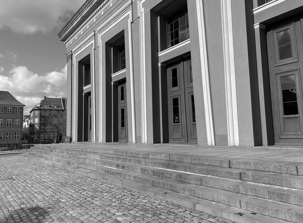
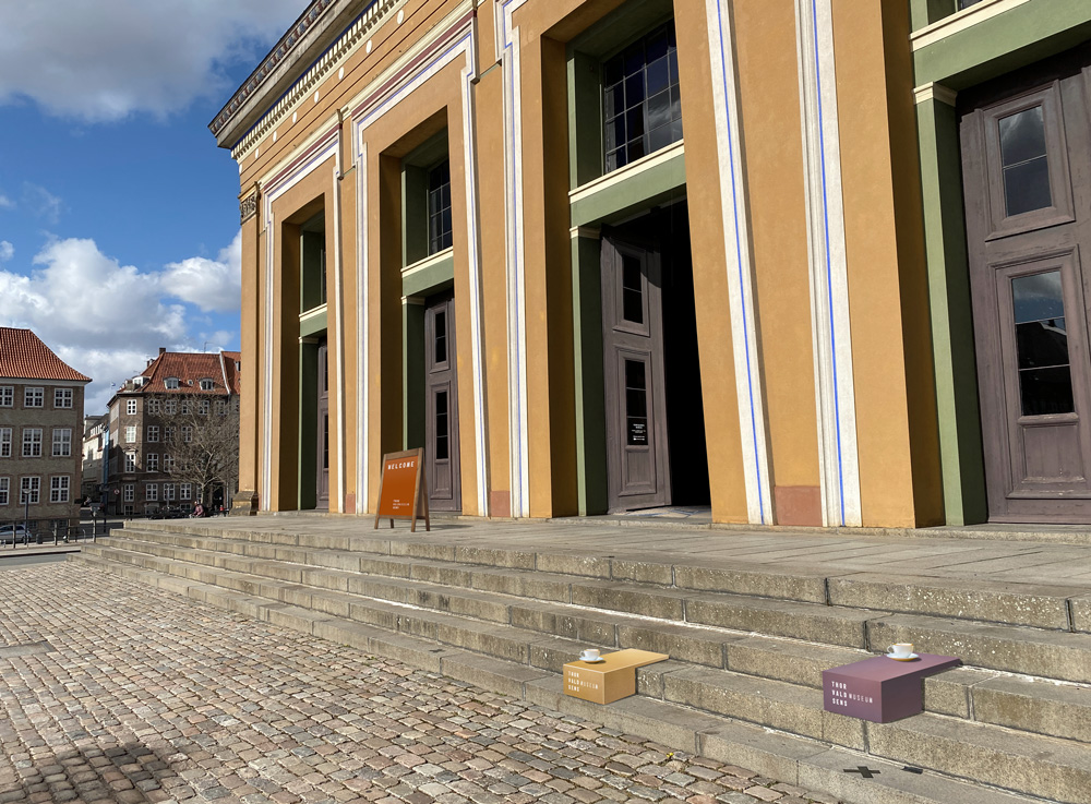
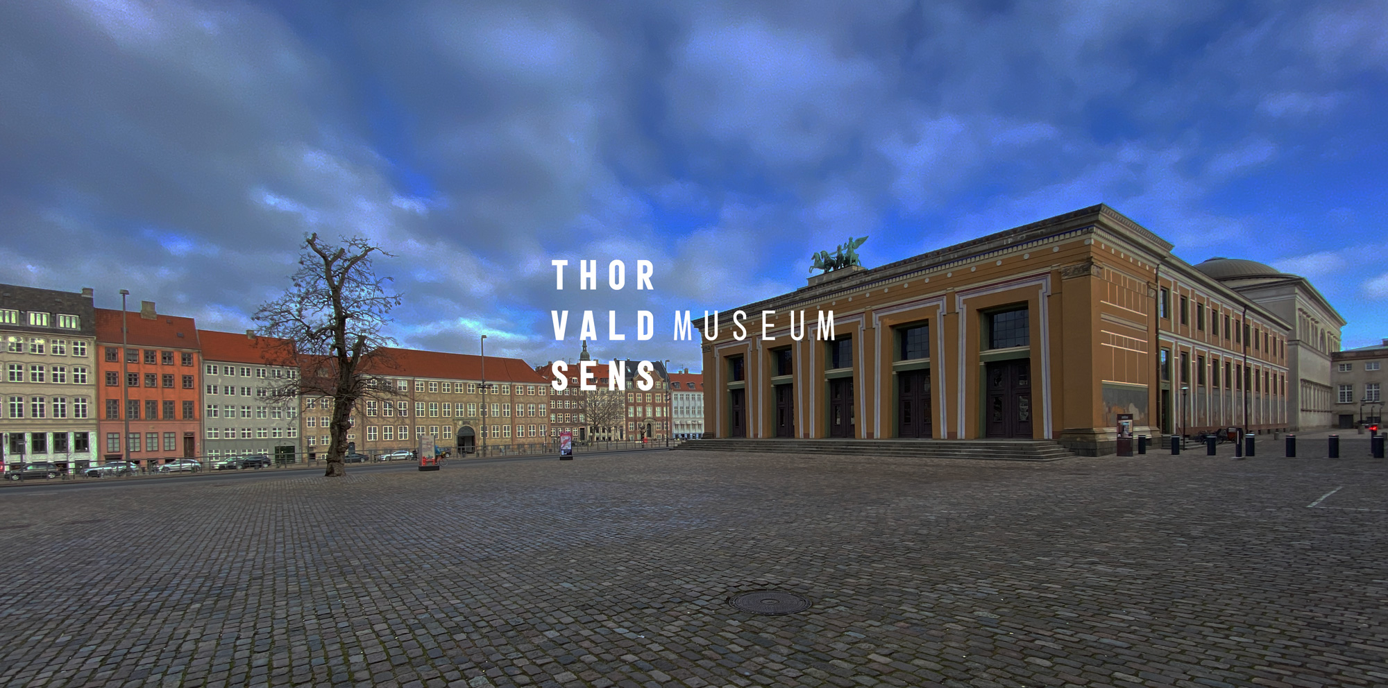
Architects and specialists have long been experimenting with opening up the epic Thorvaldsens Museum at it’s original entrances; The western gates towards Bertel Thorvaldsens Square and the inner city. Every intention about sculptor Thorvaldsen, architect Gottlieb Bindesbøll and the City council of Copenhagen gift to it’s citizens, from aritocratic elite to homeless beggars points to this opening. My project could stop by demanding that we should do everything in power to make this opening become a reality.
Then perhaps we should be able to open up the worlds first public museum in a western democrathy, at it’s original gates, welcoming the vibrant life of the eternal today, instead of letting people in at a backdoor?
Sadly, i’m not an architect. And my specialty is graphic design. Having experienced the museums existing graphic identity, this was an area where I could contribute to something. The project imagines that this opening becomes a reality and how a miraculous event like that, would require a redesign of the whole identity.Following visuals indicates a direction.
I wanted the story behind the museum, an insitution, not alone in danish art history, but in danish national identity and democrathy, to come forward and gain relevance today. To take the perspective of Thorvaldsen and Gottlieb Bindesbøll as the dedicated mentors they both where.
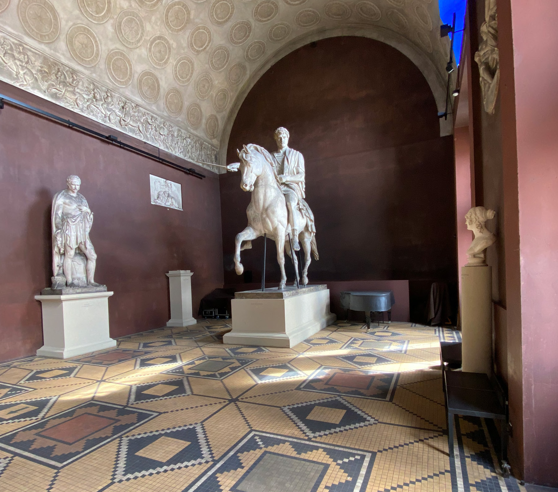
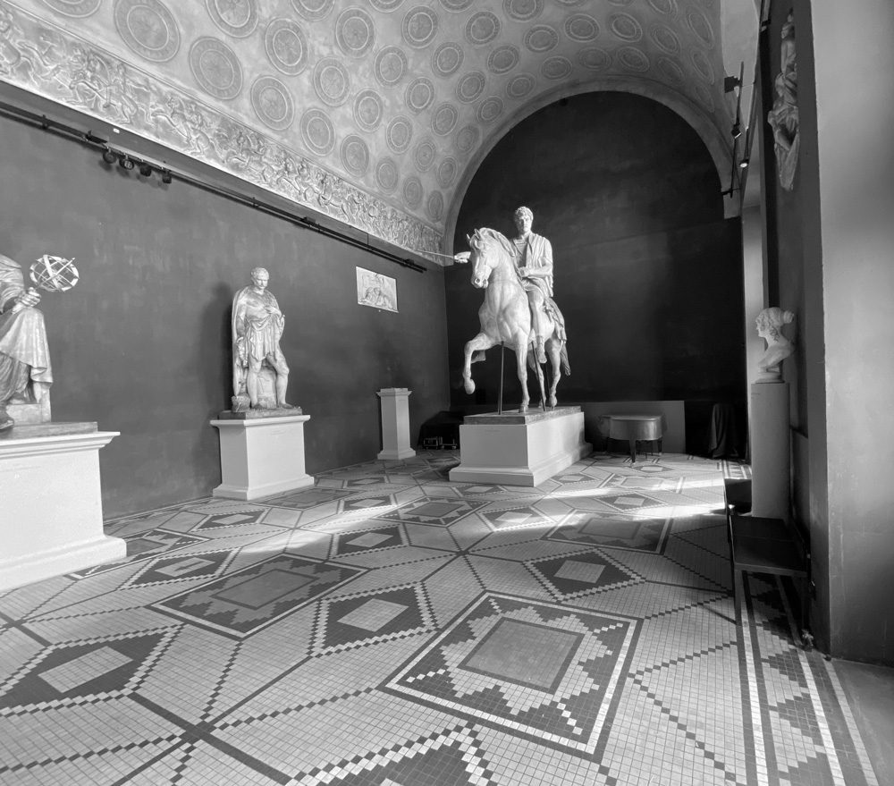
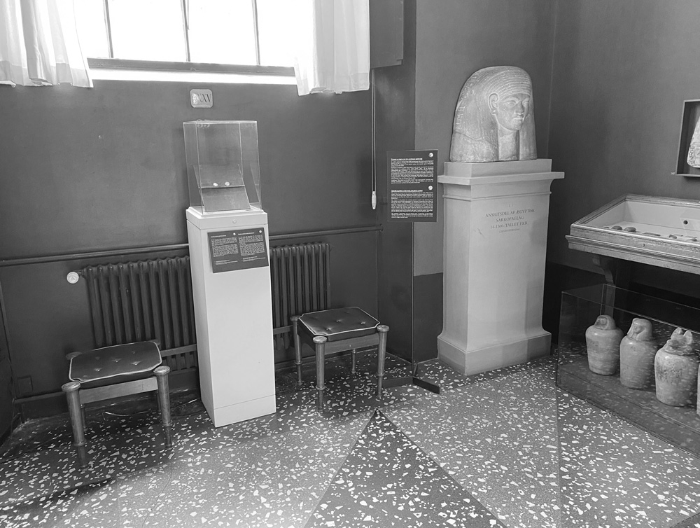
Existing photo from the closed off Grand Hall. Visible props with no relation to the exhibition disturbs the experience
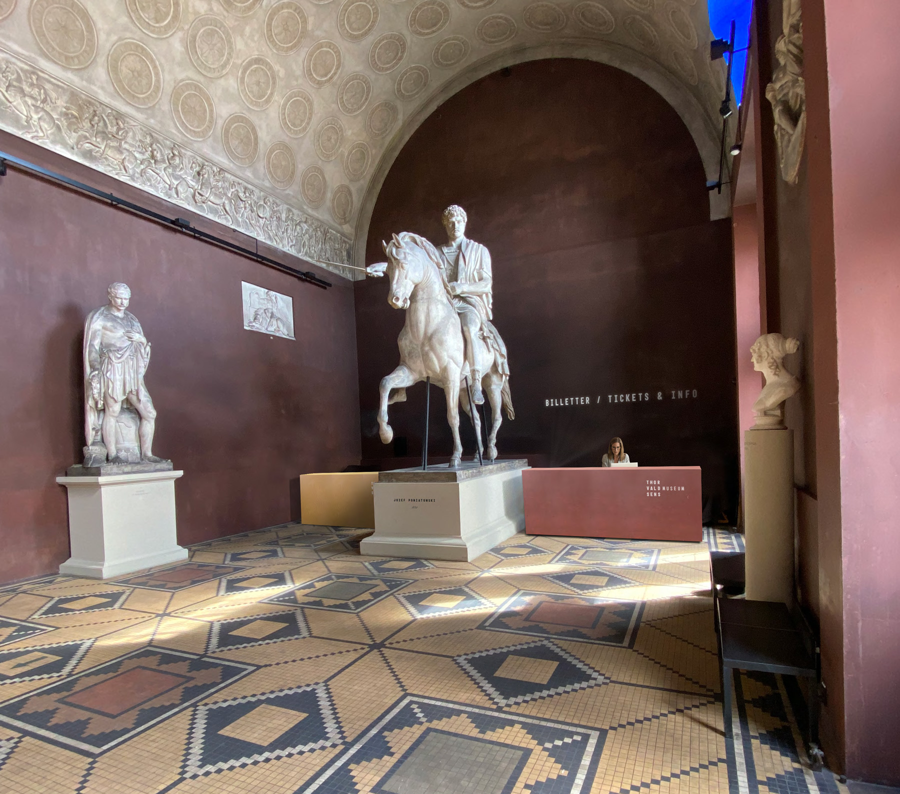
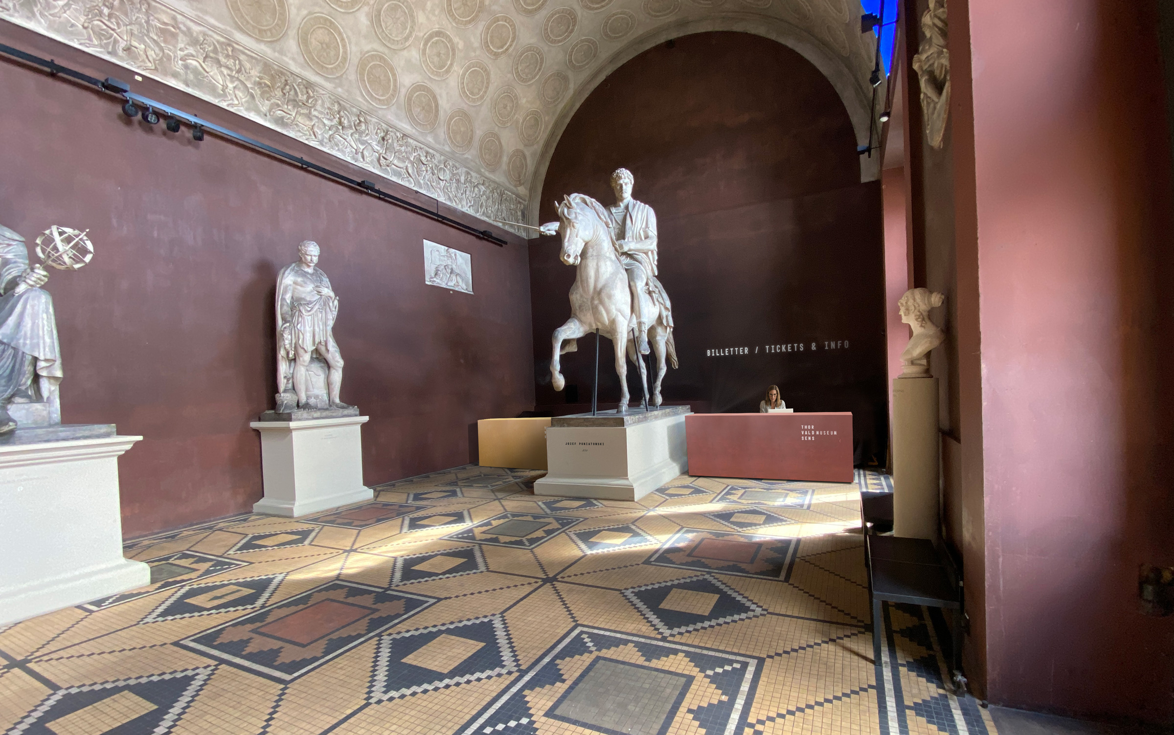
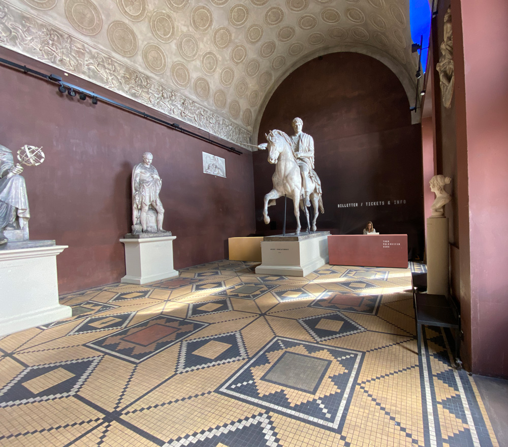
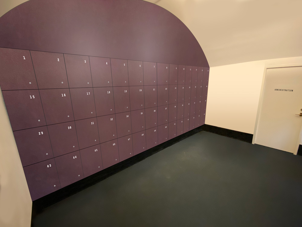
Moveable desks tickets stands at the new opened Grand Hall. In a color pallette and surface that blends in as part of the space.
The hammer
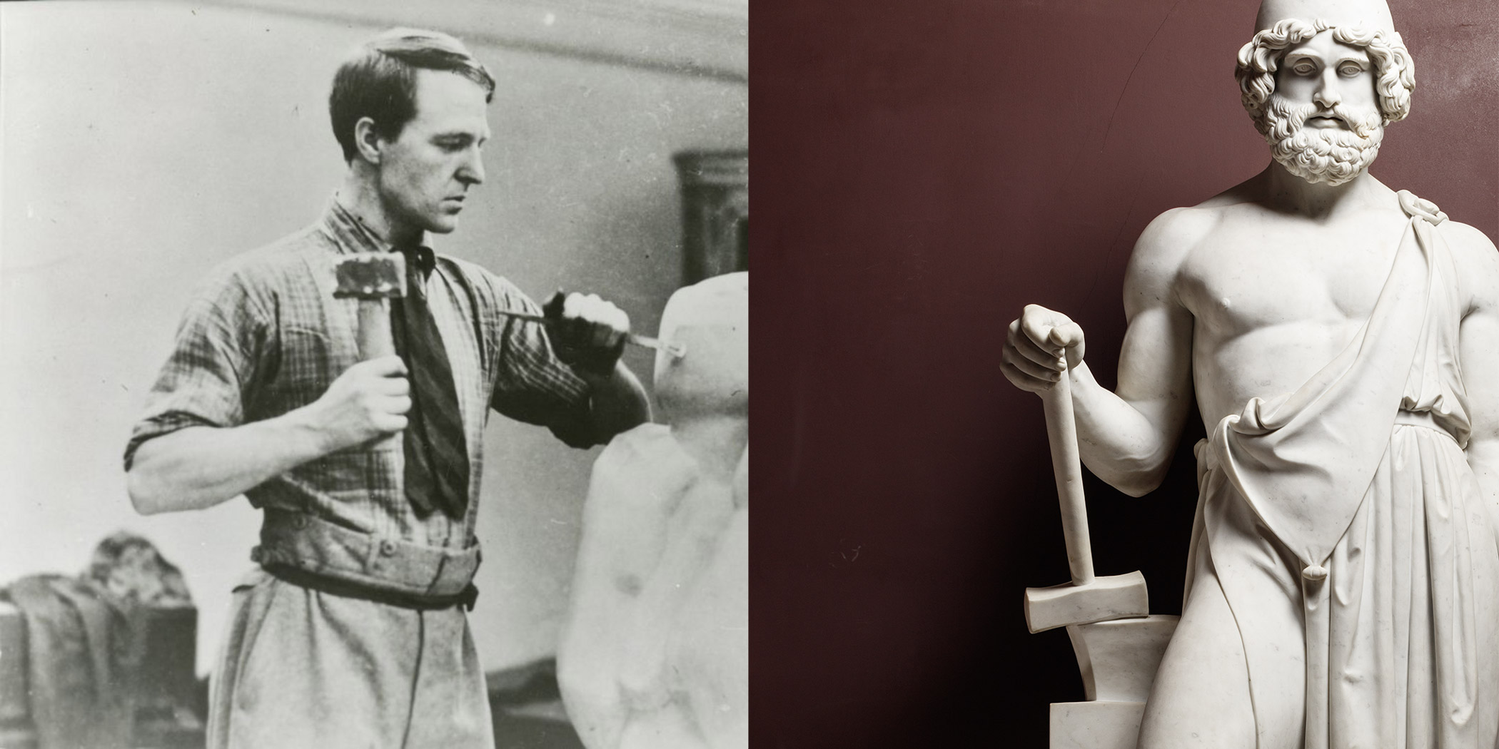
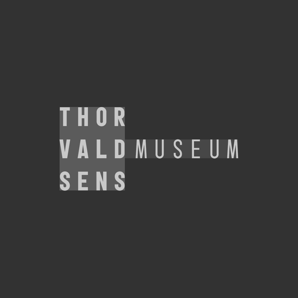
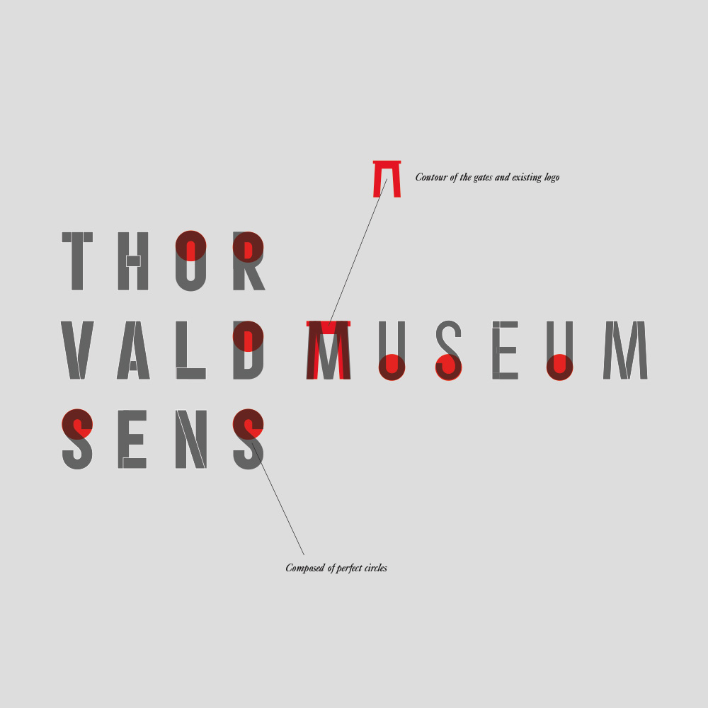
A sculptors hammer functions as an extension of his ambition and makes him able to hit the chisel with such strength that the unwanted stone splits apart from the block – eventually revealing the shape. While a hammer is a symbol of strenght, it is also that of the working class. Thorvaldsen not only felt a strong bond to his workingclass background, but he also created Vulcan, the good of craftmanship, with facial proportions very similar to his own, indicating his identification with Vulcans values. My idea behind the logo, was to embed a visual outline of the hammer as a subtle reminder of the tool in the very heart of the identity. The logotype and brandmark in one.
The contemporary in the spirit of Thorvaldsen
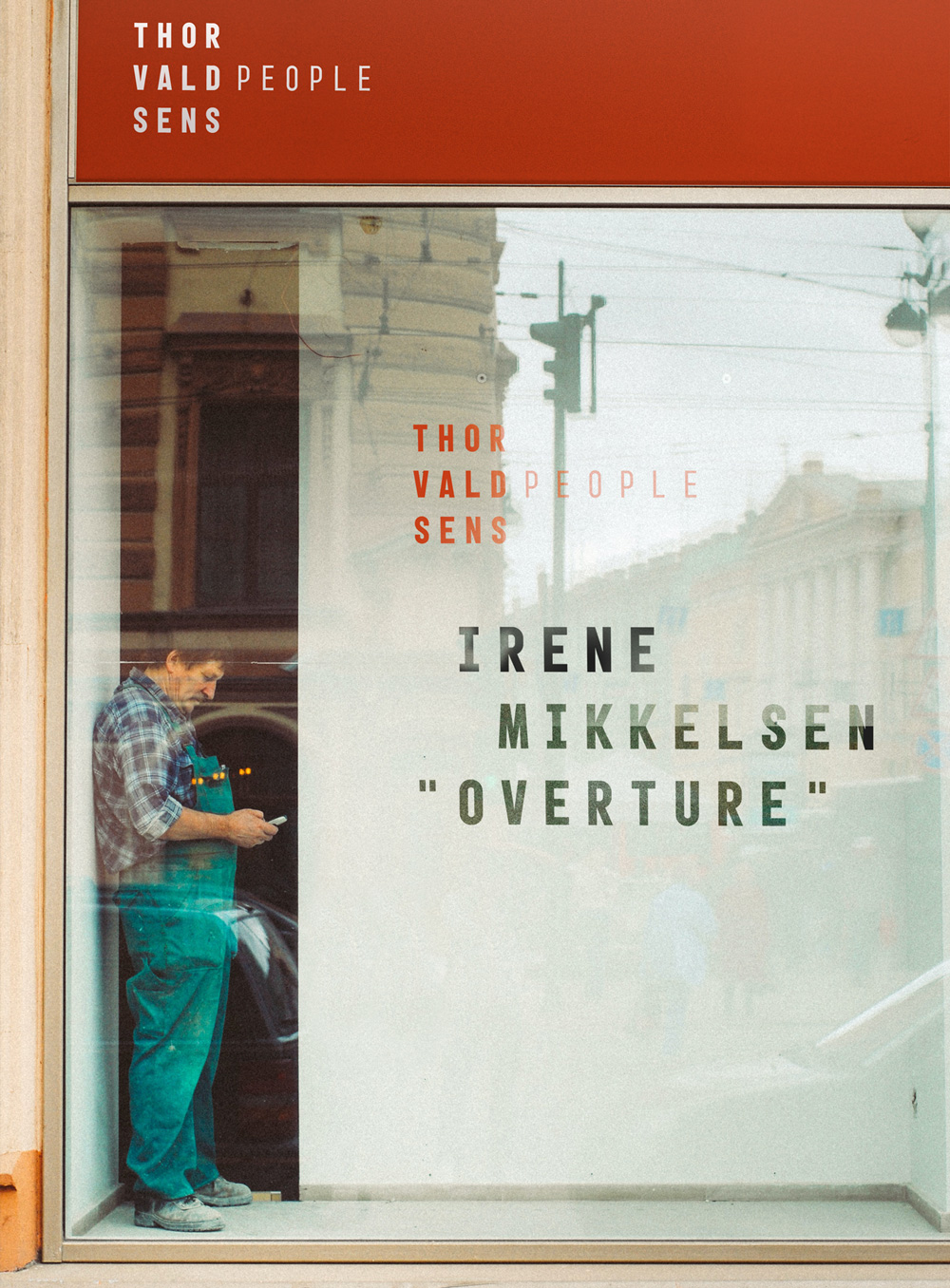
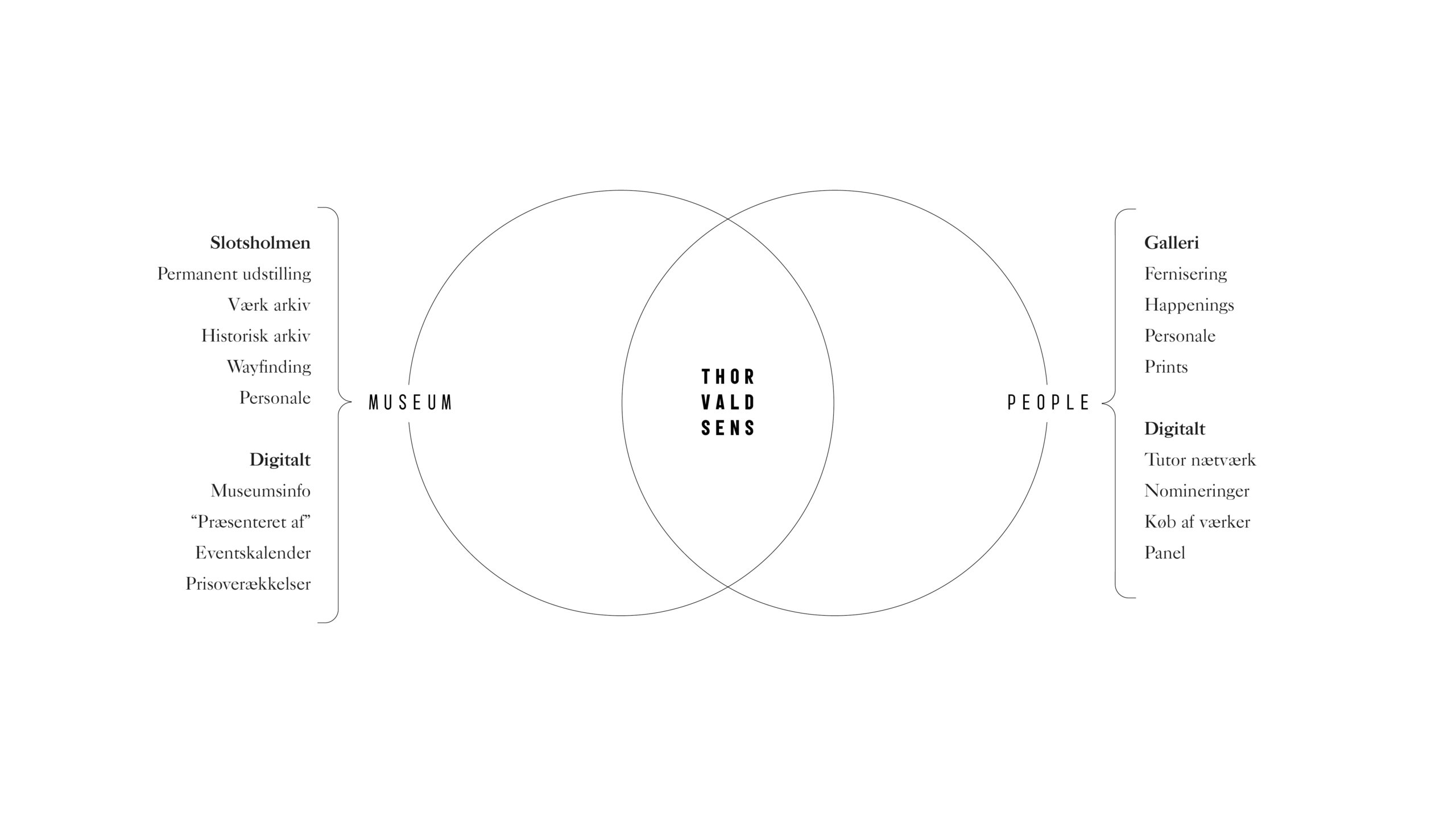
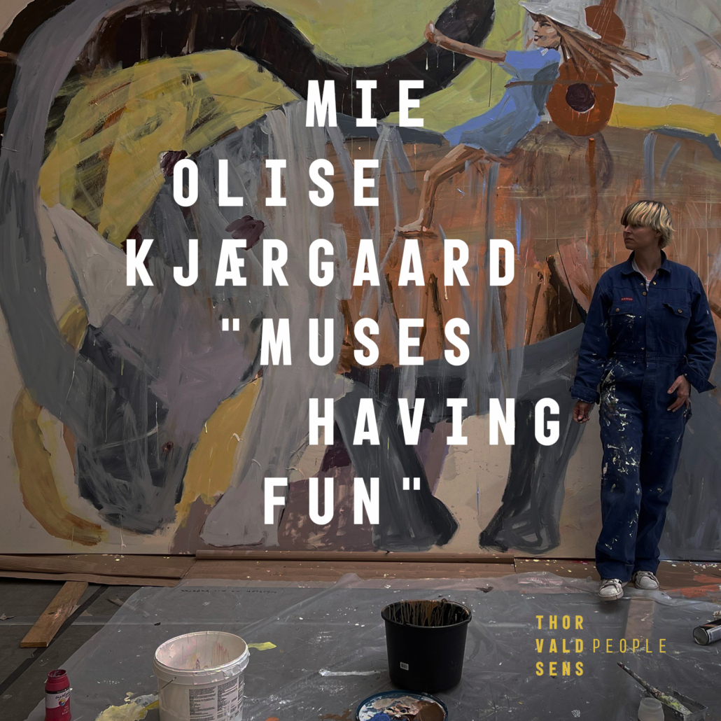
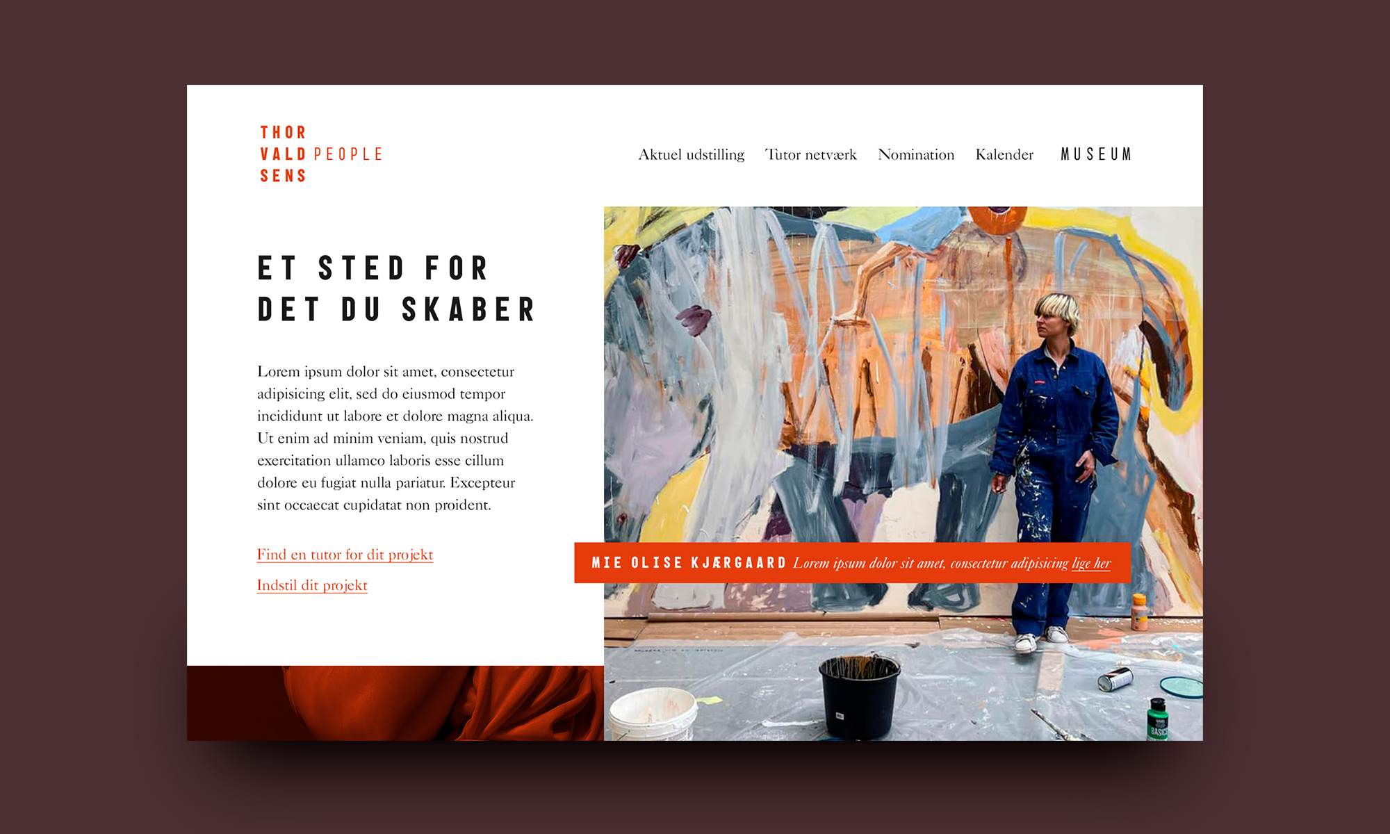
Thorvaldsens was not only an artist. He mentored, he bought, he curated art from his present peers. The idea of “Thorvaldsens People” takes Thorvaldsens values and heritage into today. A physical gallery is established as a “sattelite” to Thorvaldsens Museum in downtown Copenhagen. These venues are meant to point to eachother and thrive of eachother.
Visual identity
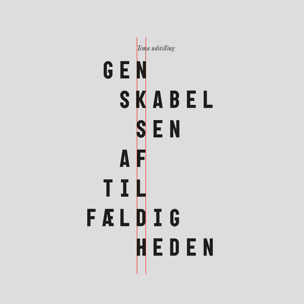
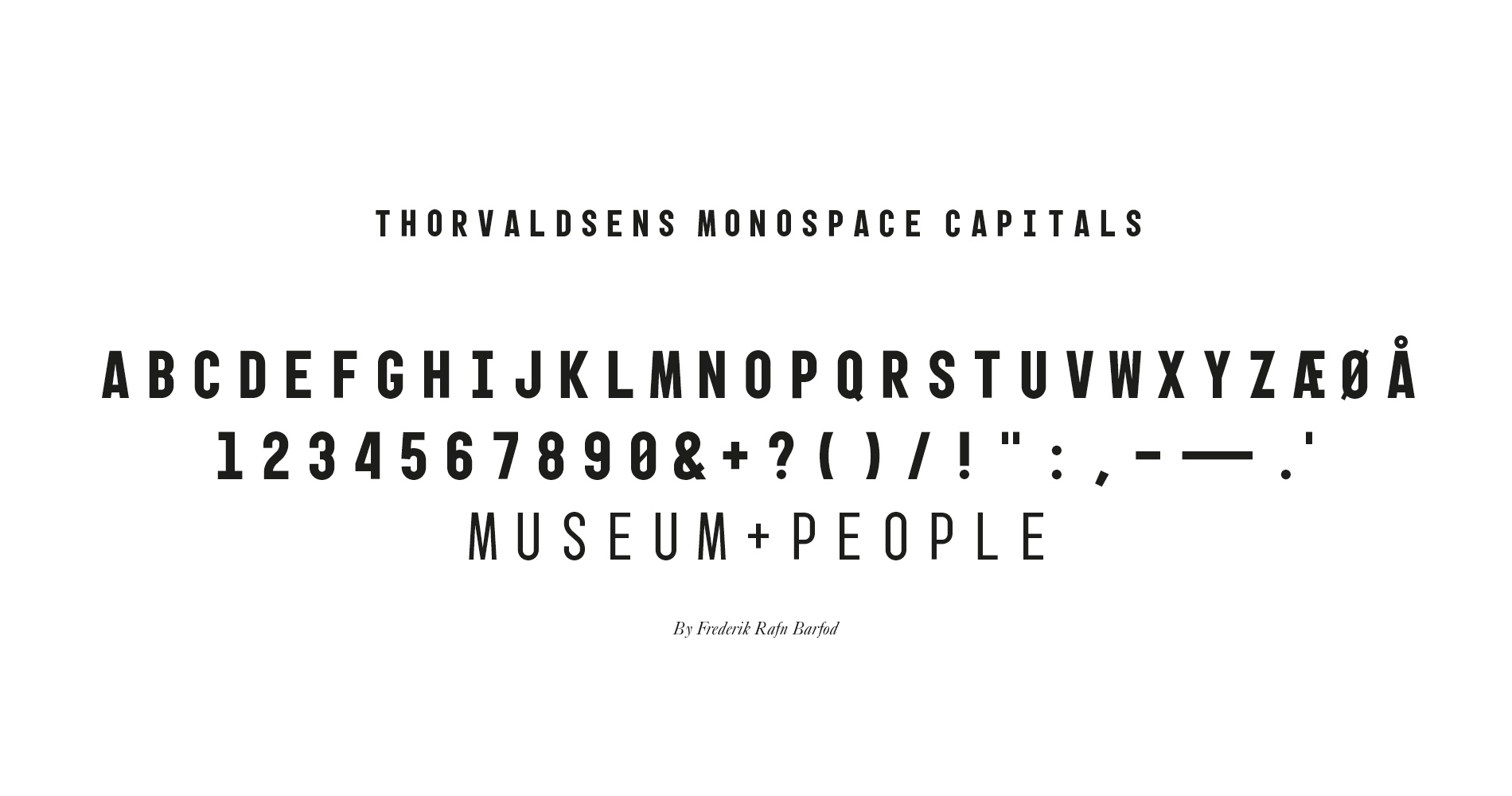
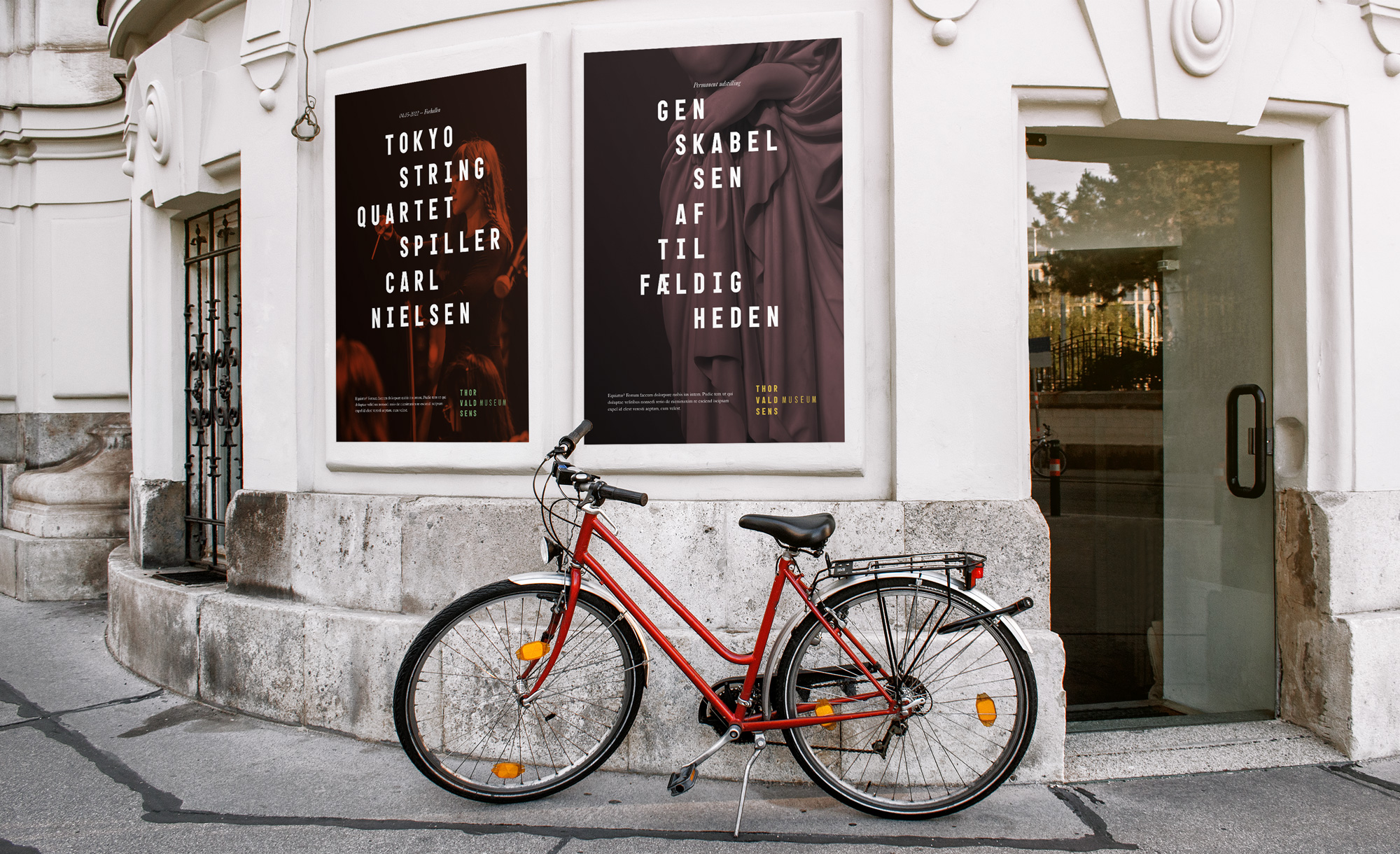
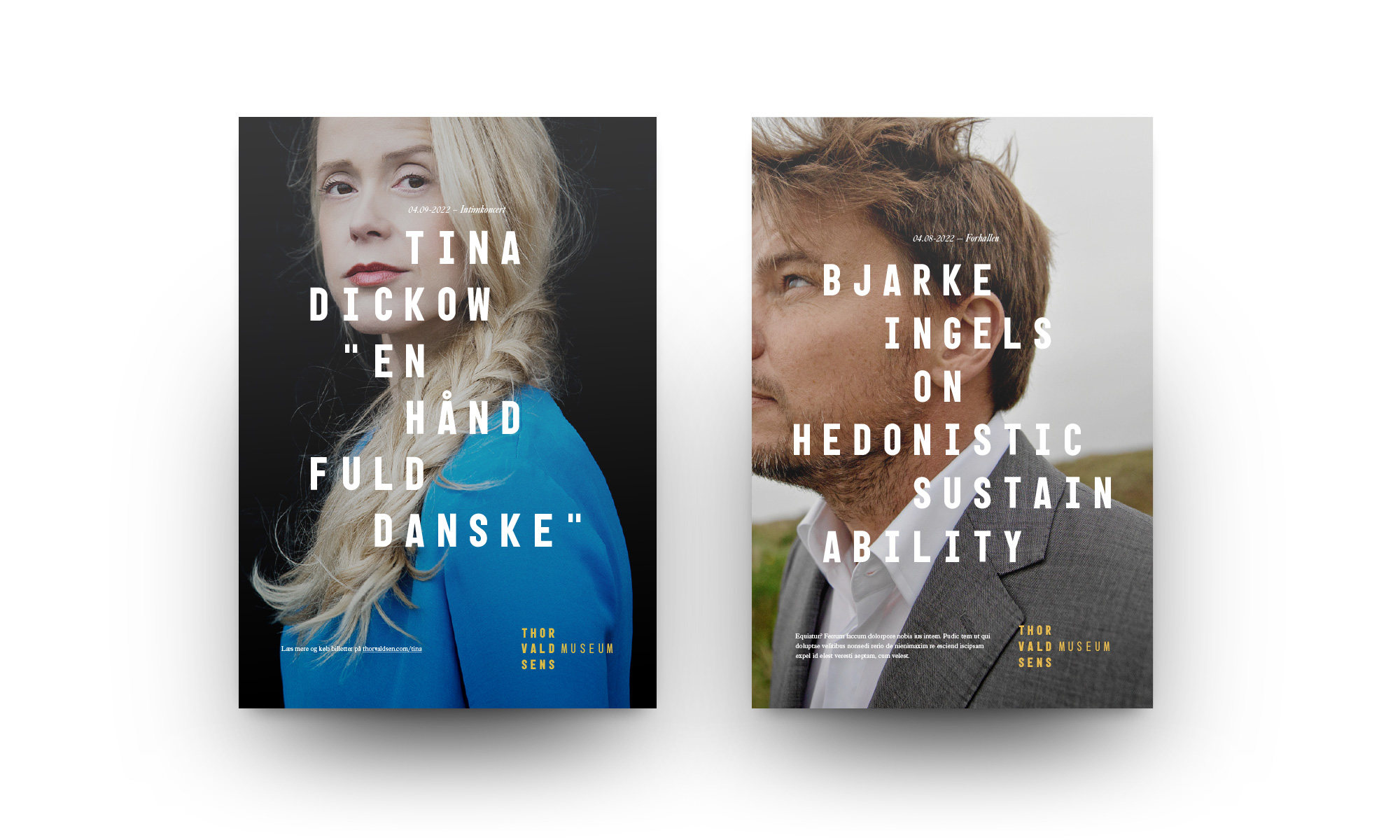
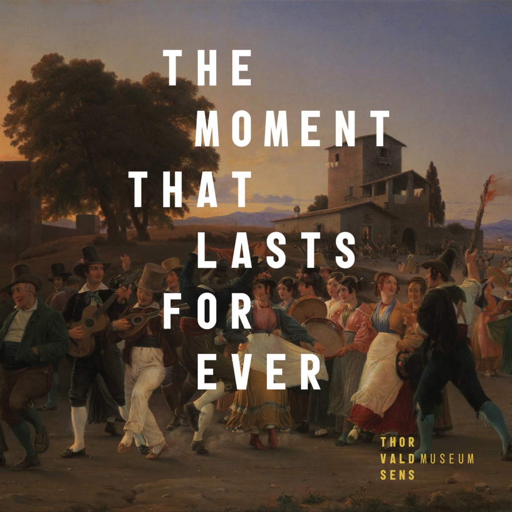
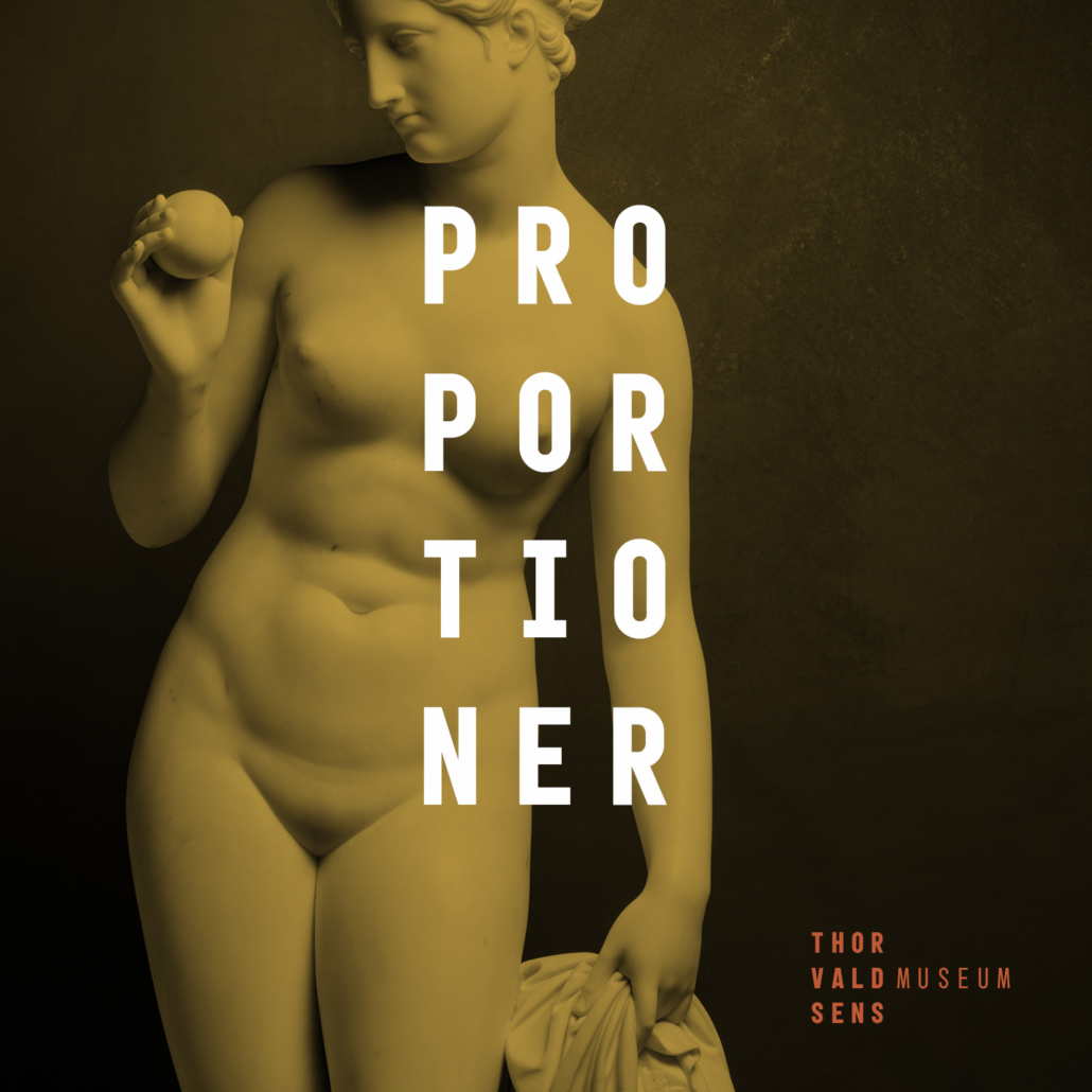
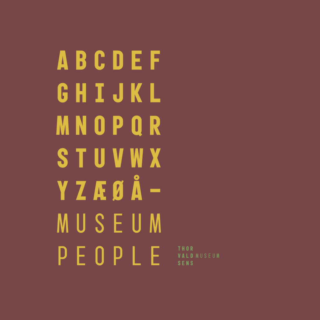
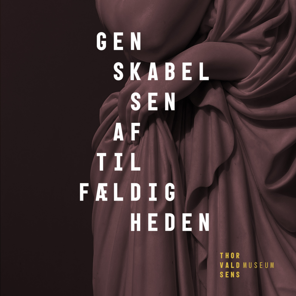
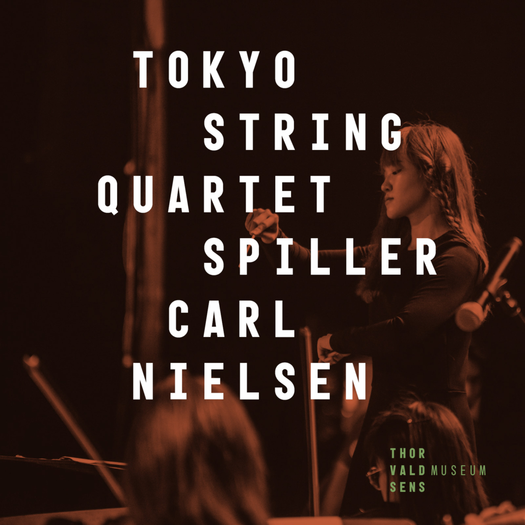
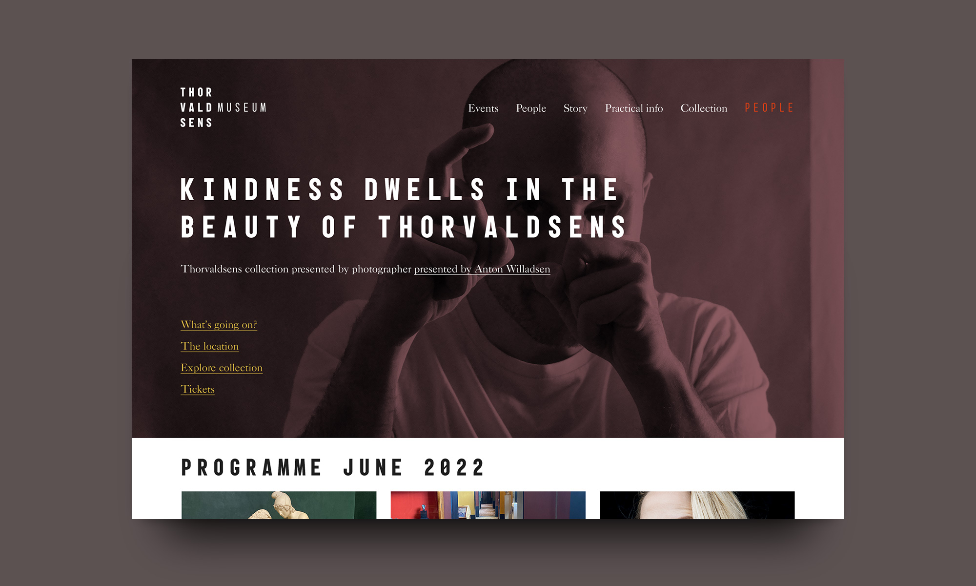
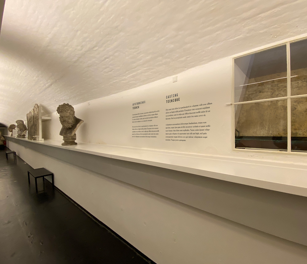
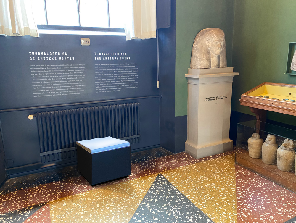
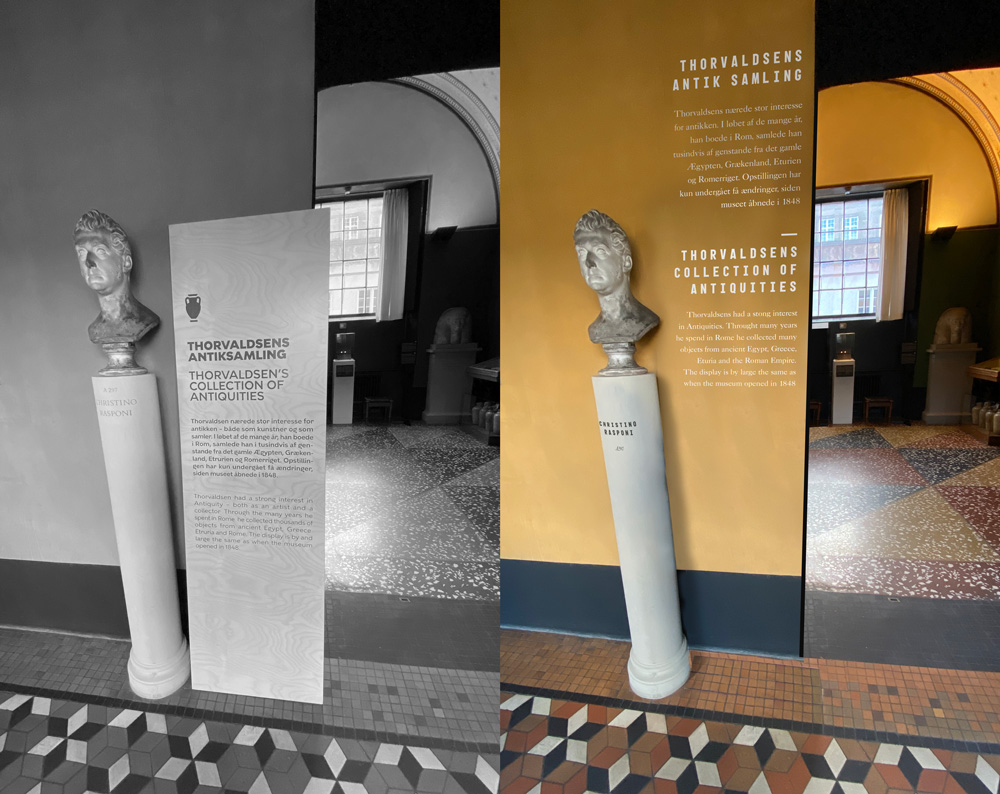
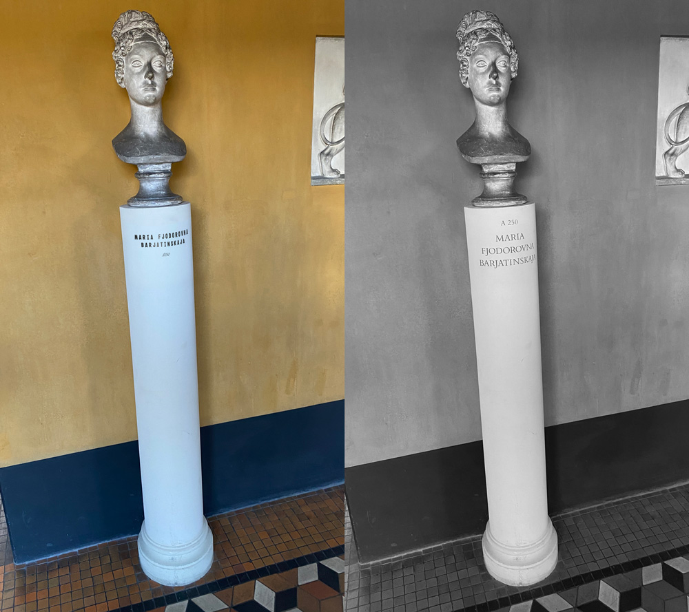
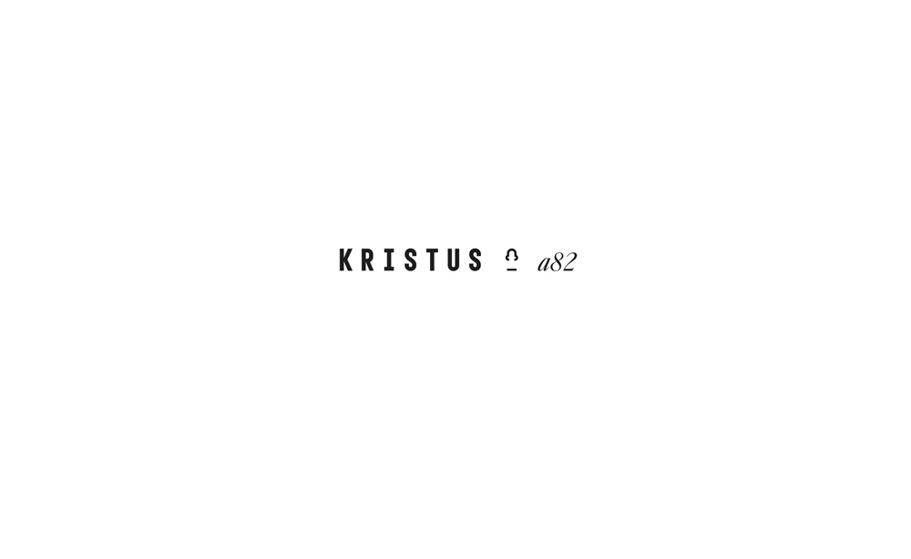
Following are exsamples from the visual identity, wayfinding and new physical arrangements. It is a result of a broad research with the intention to add a strict, systemic and sharp graphical layer on top the magnitude of diversity that this institution embraces. I created a monospace, bold and minimal typeface to underline this and offer contrast to the curved and organic shapes in the world born in Thorvaldsens mind. The alignment of the headlines are stacked compositions that, like the logo composition, suggests an outer shape that playes out in a confined space like a scultpture. They contribute to the indication of history versus the present. The worlds that meets today.
Exhibition design and wayfinding
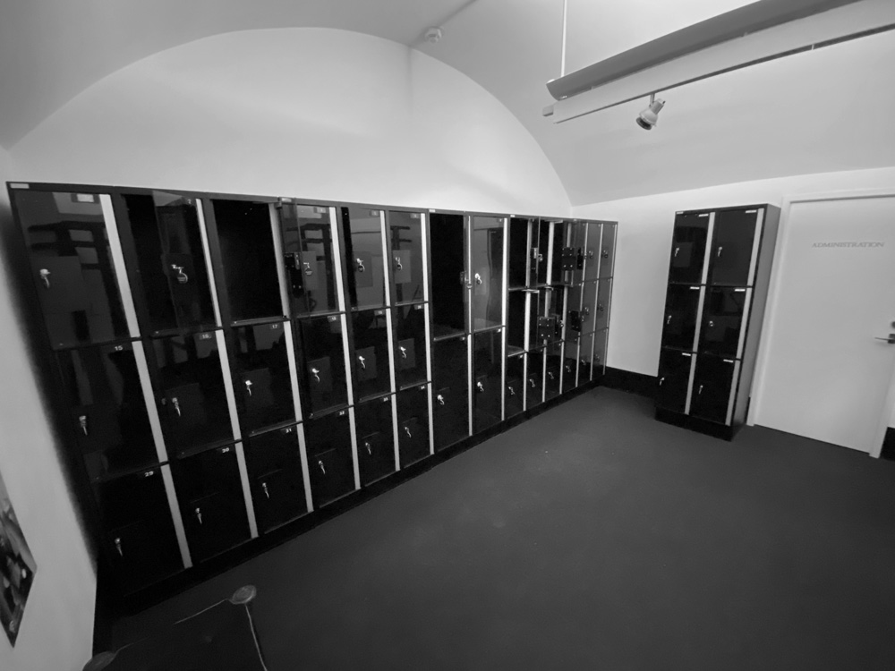
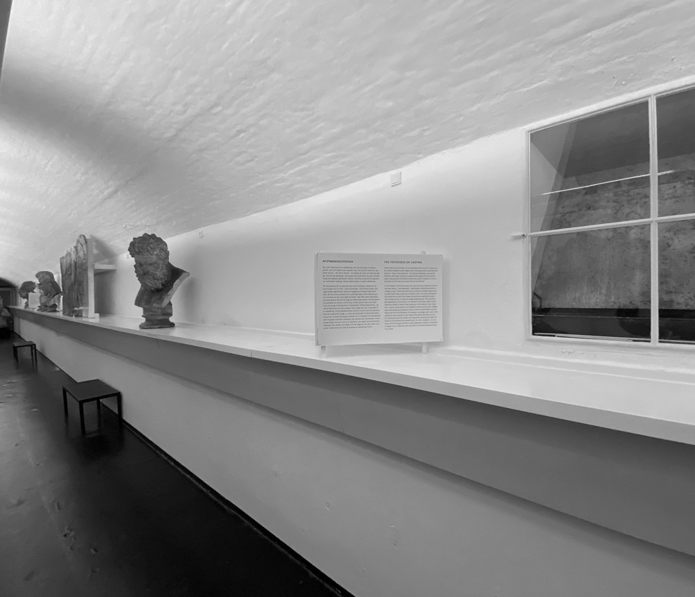
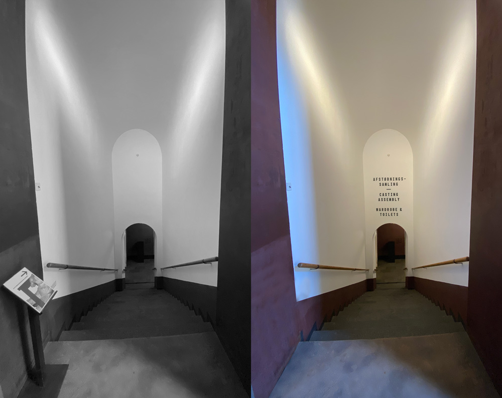
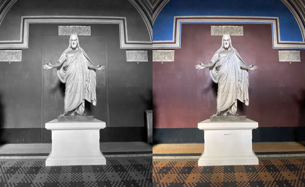
Following are exsamples of how Thorvaldsens could create a more integrated signage at Gottlieb Bindesbøls building. You will see suggestions of signage, redisposition of the interieur and how the identity can unfold at the scene on flexible moveable modules and existing walls and sculpture plinths.
Thanks to
Bente Lange
Peter Thule Kristensen
Charlotte Felding
Jens Dan Johansen
