Ofir redesign and digital identity
Facts
Ofir.dk is the second largest job search site in Denmark. Over 500.000 monthly visitors. Over 60.000 monthly jobapplications. Cover all types of jobs.
Scope
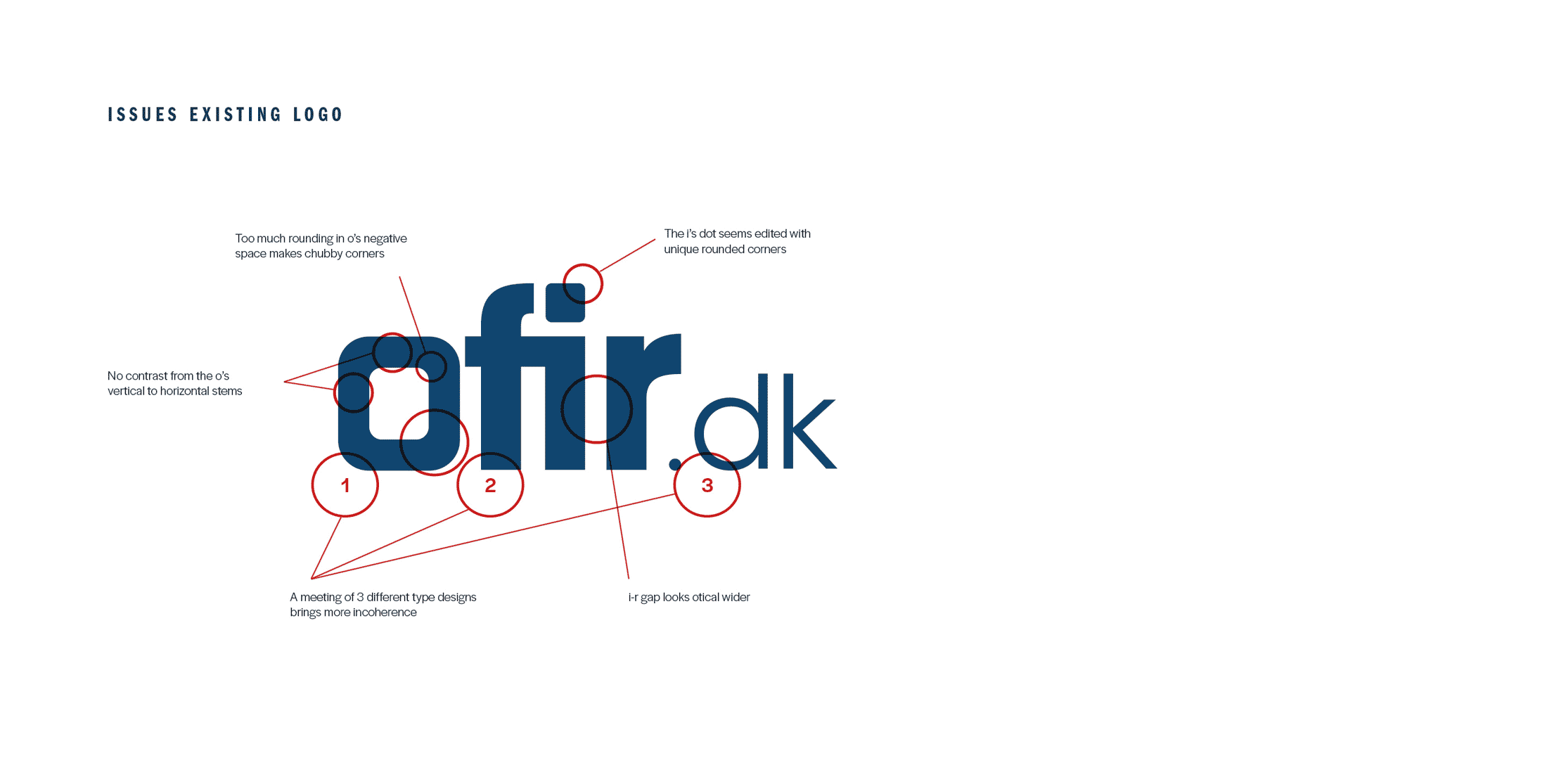
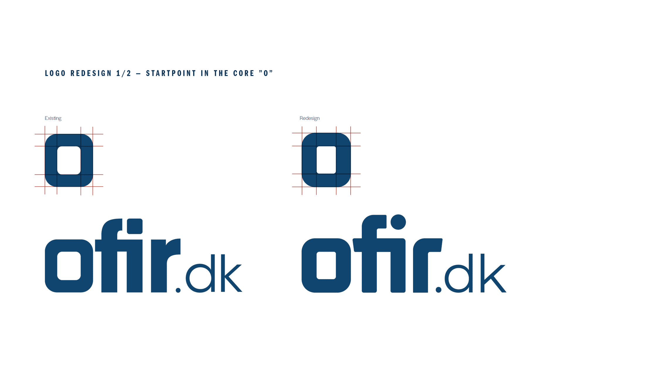
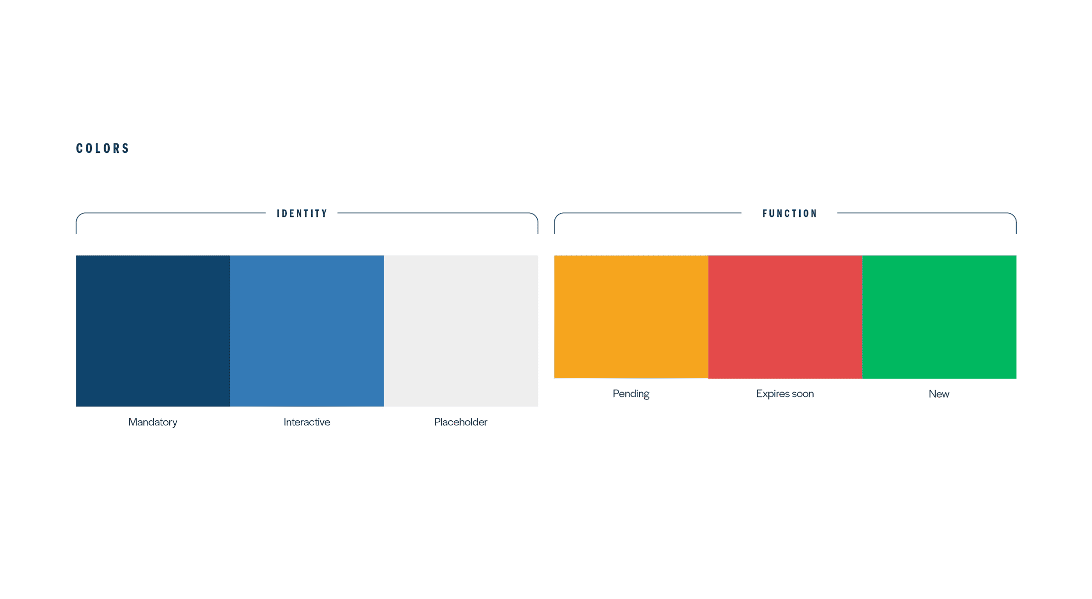
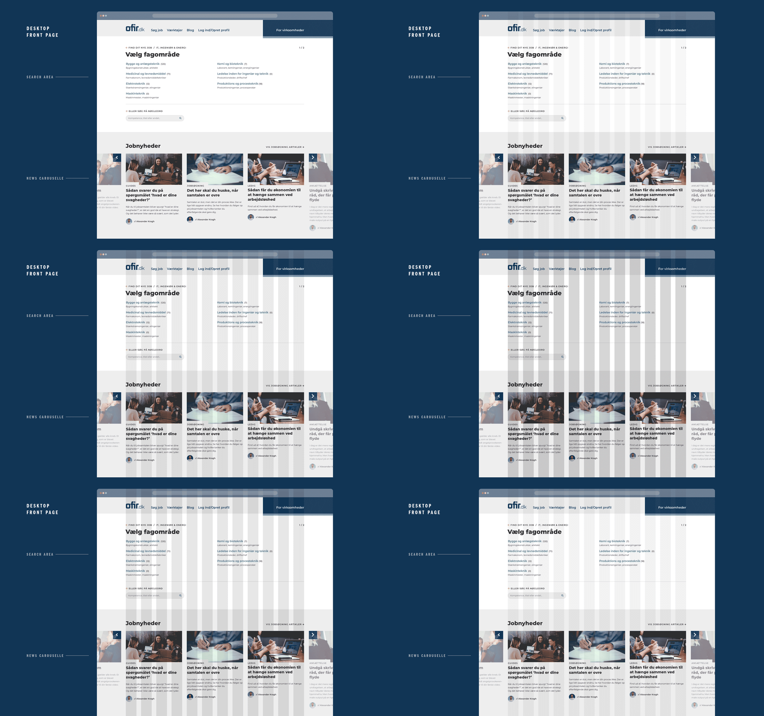
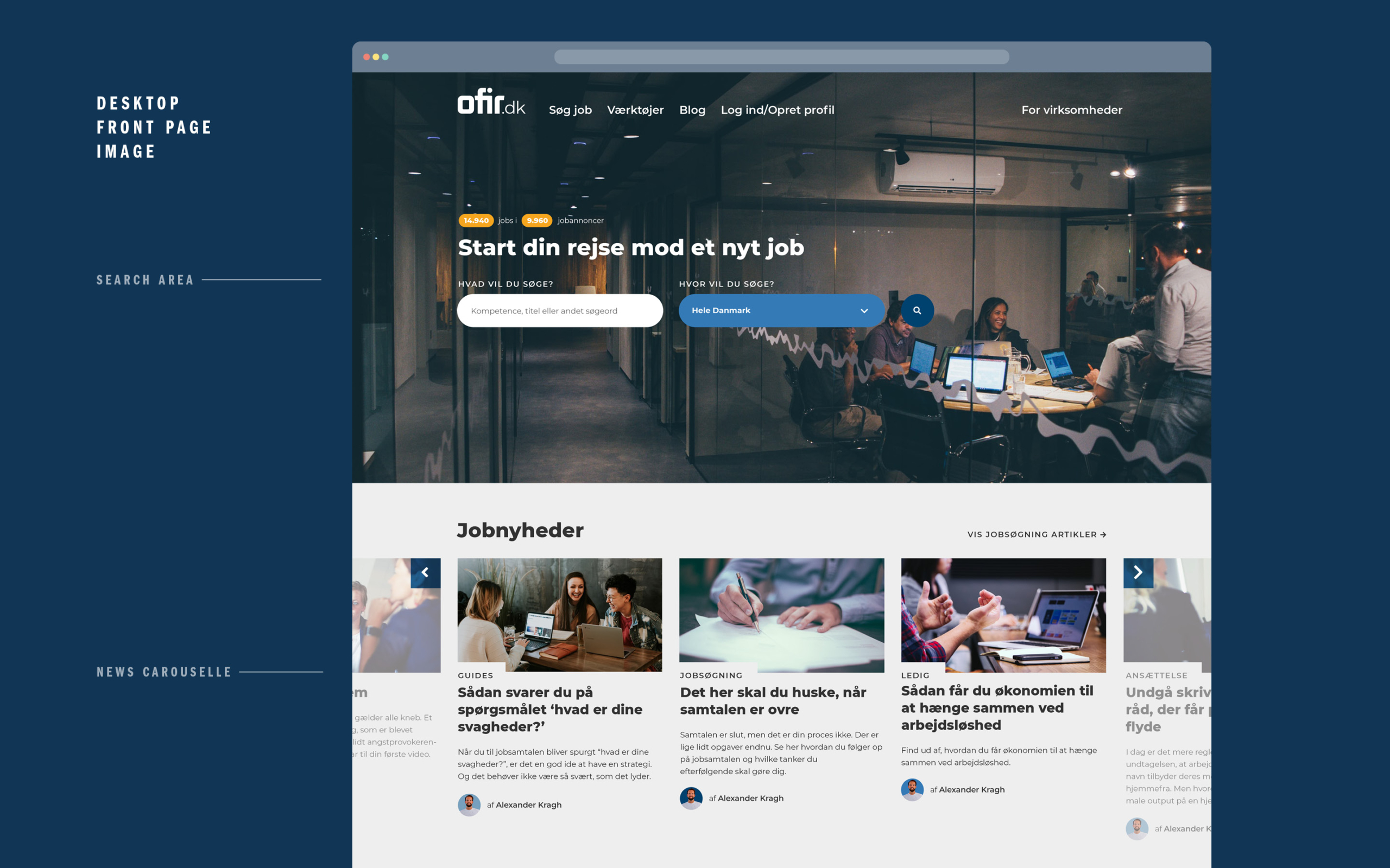
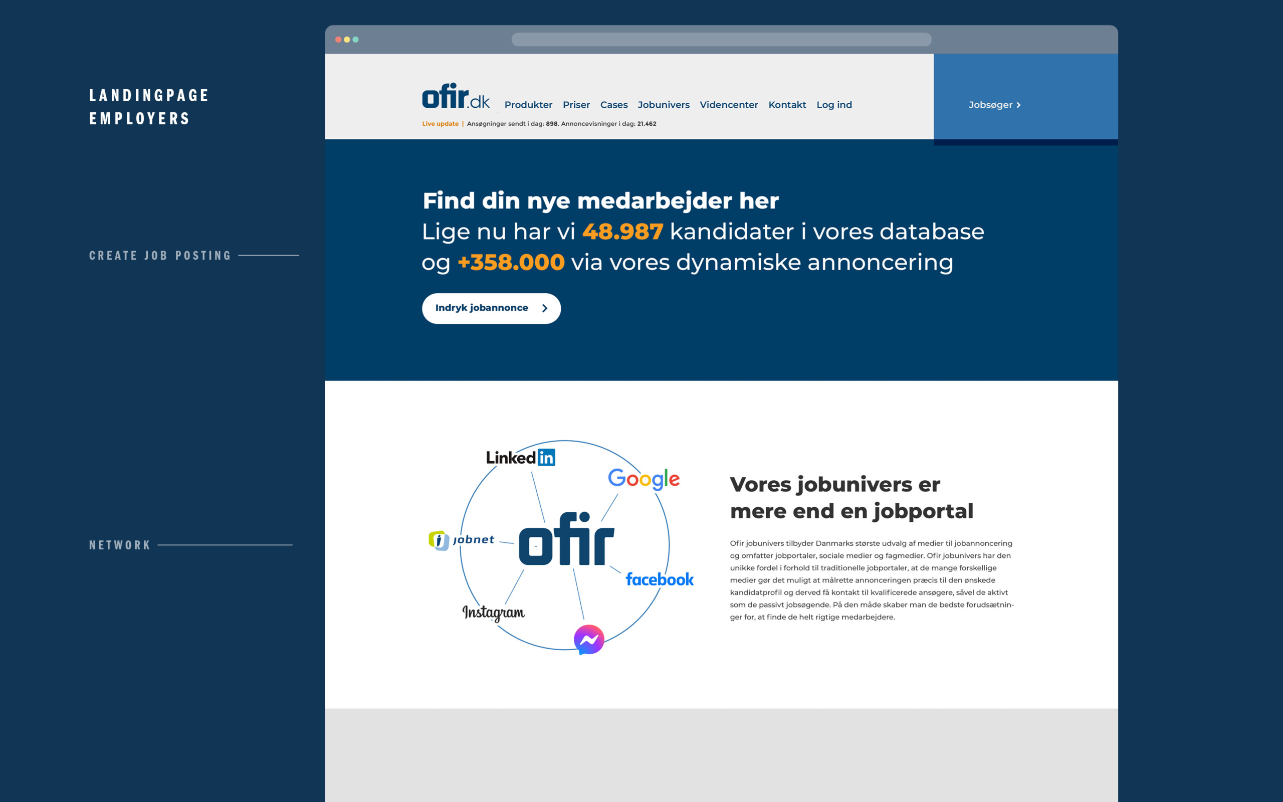
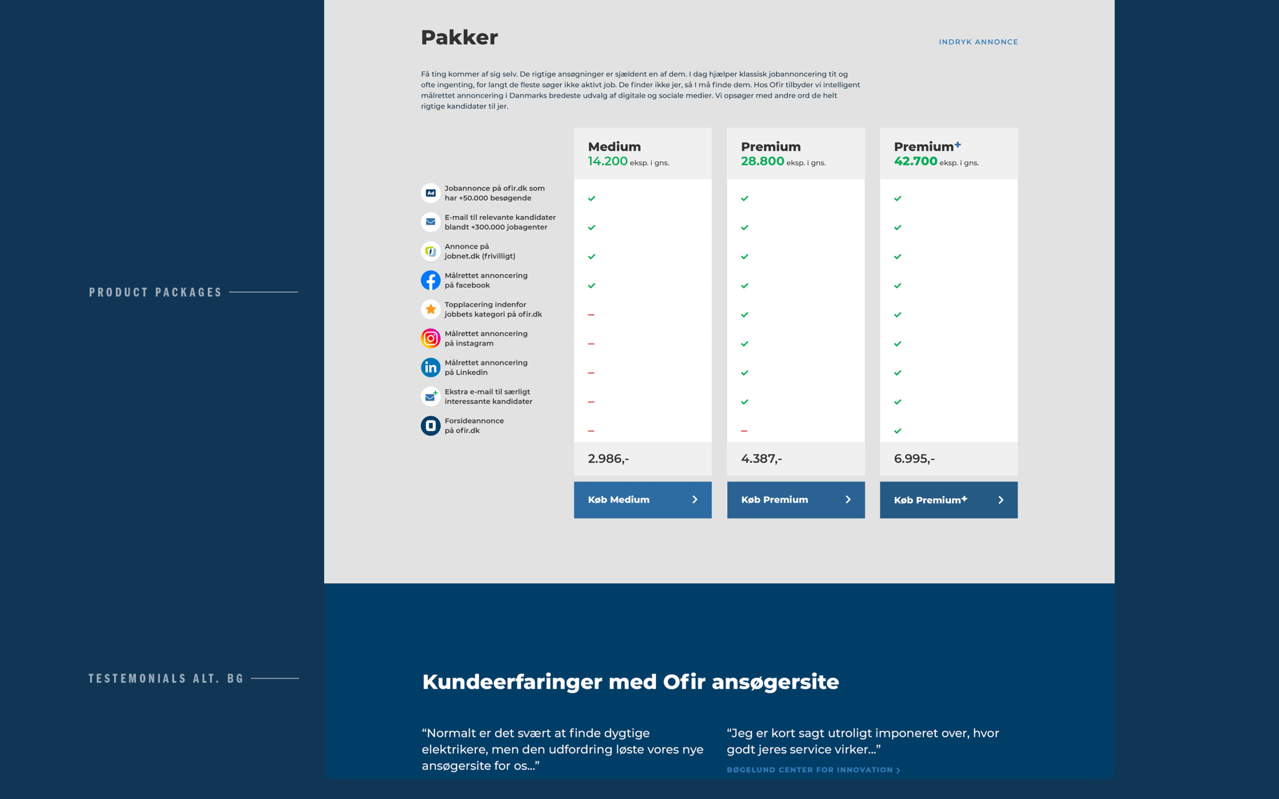
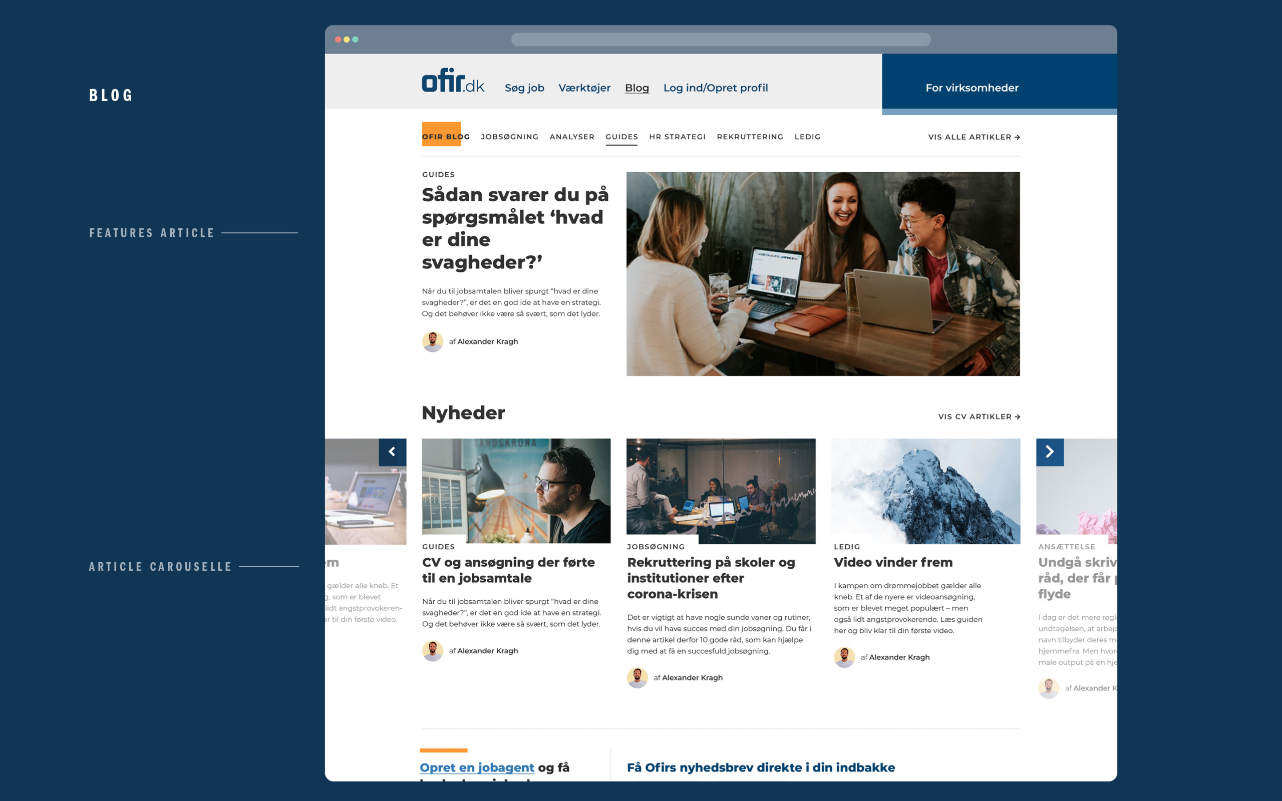
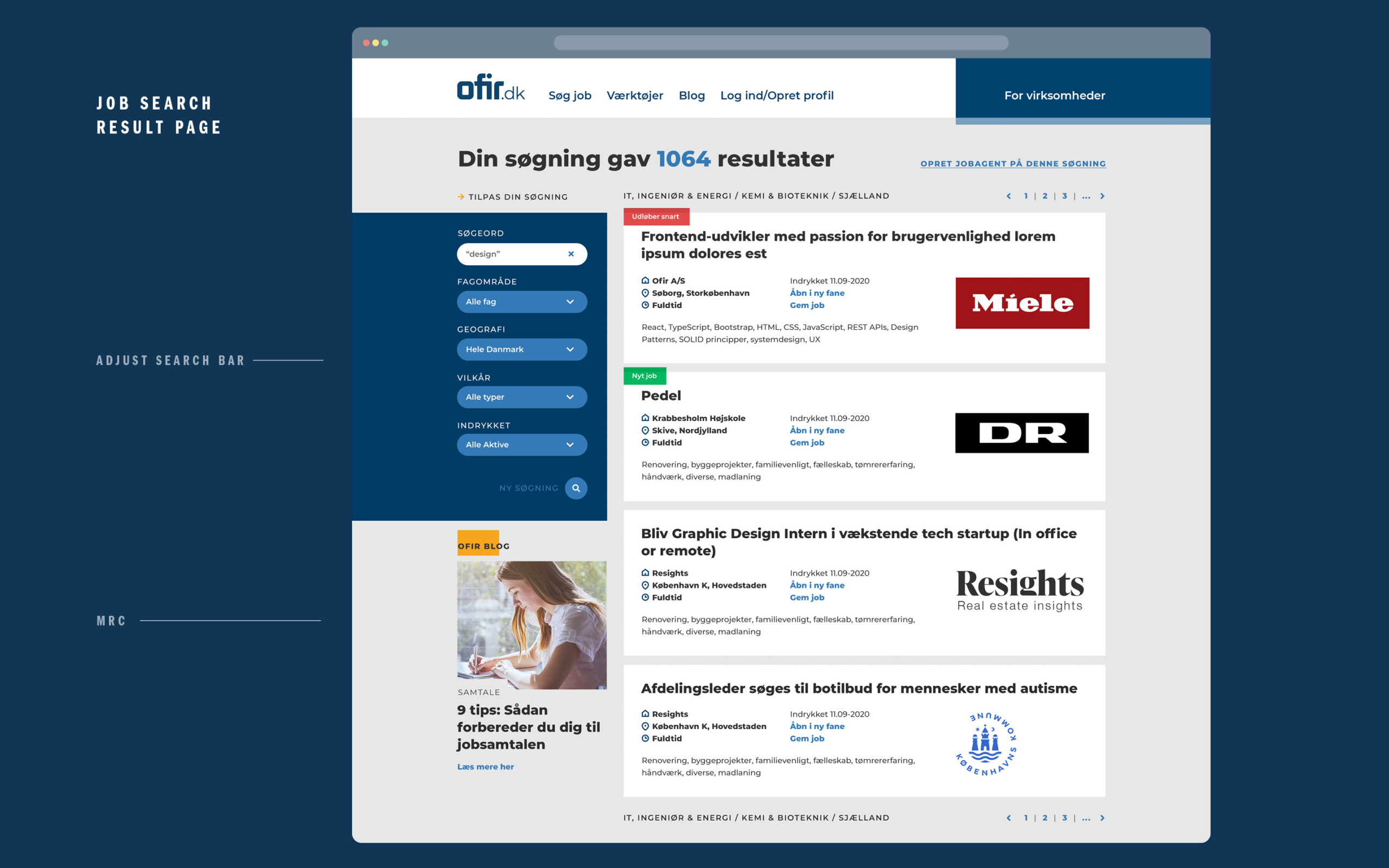
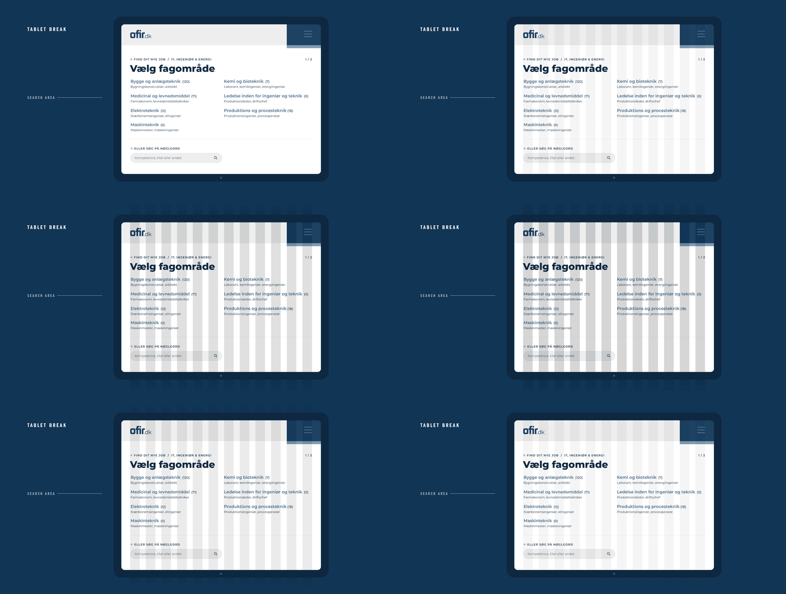
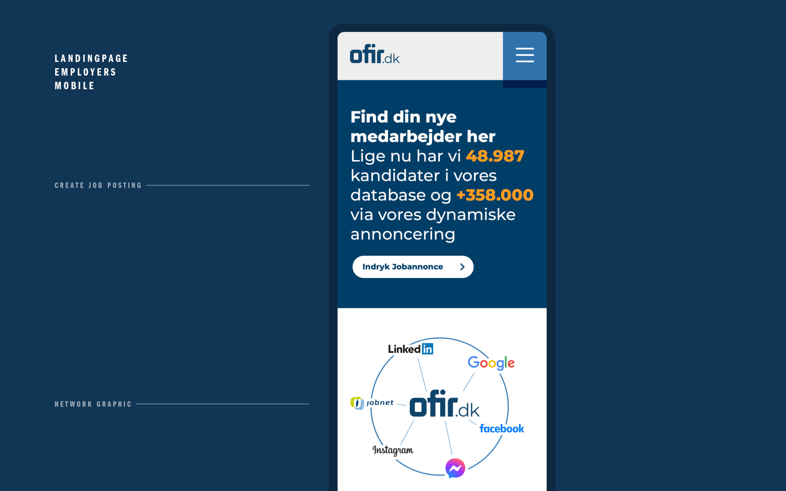
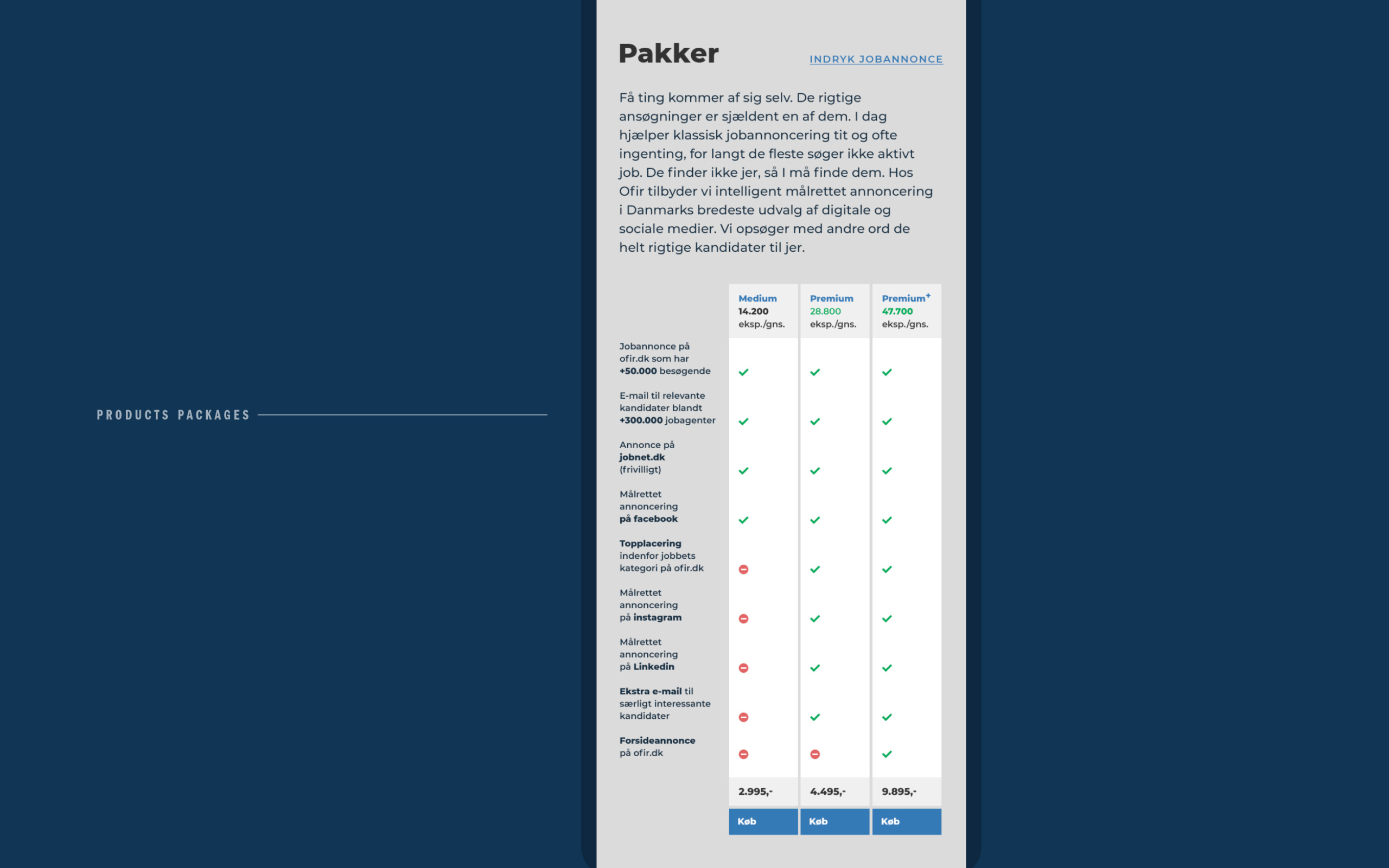
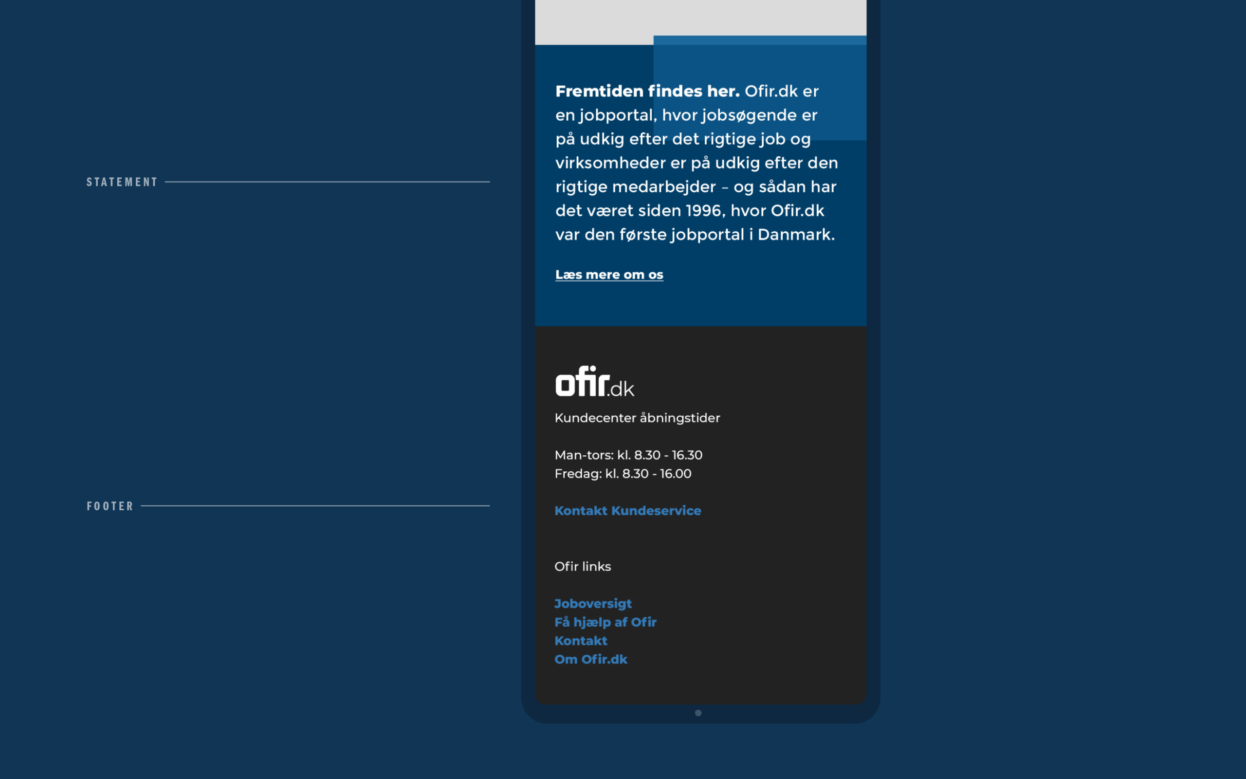
Lift the brandexperience and user experience by new frontend design. Follow the existing web functionality, architecture and structure. Due to brand history and recognition; use existing colors and logo base.
Issues in existing design
Wague sence of a general aligment or grid. Lack of hierachy and contrast in typography. Experienced hierarchy does not seem not to follow intended hierarchy? Too wide columns with resulting in poor readability. Boxed and crammed design with surrounding ”no-mans-land”. Experienced hierarchy seems not to follow intended hierarchy? The modules seem developed along the way. Leeds to… Inconsequent graphical experience and thereby a poorer UX.
Key areas for new design
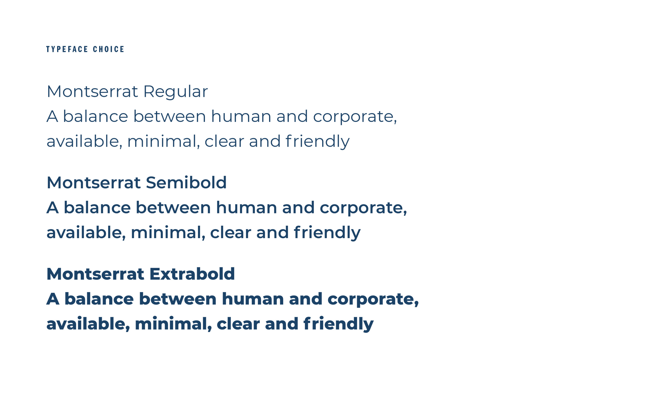
Brand status: Well established and widely recognized in Denmark. 24 years of experience and know-how. The serious and formal way. Both municipal and private jobs. Supervisor and guide – ”on your side”. The experts are at Ofir. Simplicity and availability. Crucial content and offers for both employer and employee. The corporate goes hand in hand with the human. The obvious job search and recruitment tool.
